
Article
How UX web designconverts visitorsinto customers.
User experience is not decoration. It is the set of decisions that determine whether somebody who arrives on your website ends up contacting you.
Published September 11, 2024. Updated September 15, 2026.
Most businesses trying to get more from their website start by trying to increase traffic. That is usually the wrong end of the problem. If a hundred people visit and two get in touch, doubling the traffic gets you four inquiries. Doubling the conversion rate gets you the same result without spending anything on advertising, and it makes every future visitor more valuable.
Speed is the first UX decision
Before a visitor evaluates your design, they have to see it. A meaningful share of mobile visitors abandon a page that takes more than about three seconds to load, and they do not tell you they left. Every large image, every unnecessary script, and every plugin nobody uses is a tax paid by every visitor.
Answer the question the visitor arrived with
Somebody landing on your site is usually trying to establish one of a small number of things: do you do the thing I need, do you work in my area, are you any good, and how much does it cost. If those answers are not visible almost immediately, a proportion of visitors will leave and check a competitor instead of hunting.
One obvious next step per page
Pages offering five equally weighted options tend to produce no action at all. Each page should have one clear primary action, visually dominant, repeated as the page gets longer. Secondary options can exist, they simply should not compete.
Shorten your forms
Every field you add reduces completion. Ask for what you genuinely need to respond and gather the rest in the conversation that follows. A form asking for company size, budget range, and how the visitor heard about you is optimized for your convenience, not theirs, and it costs inquiries.
Design for the thumb
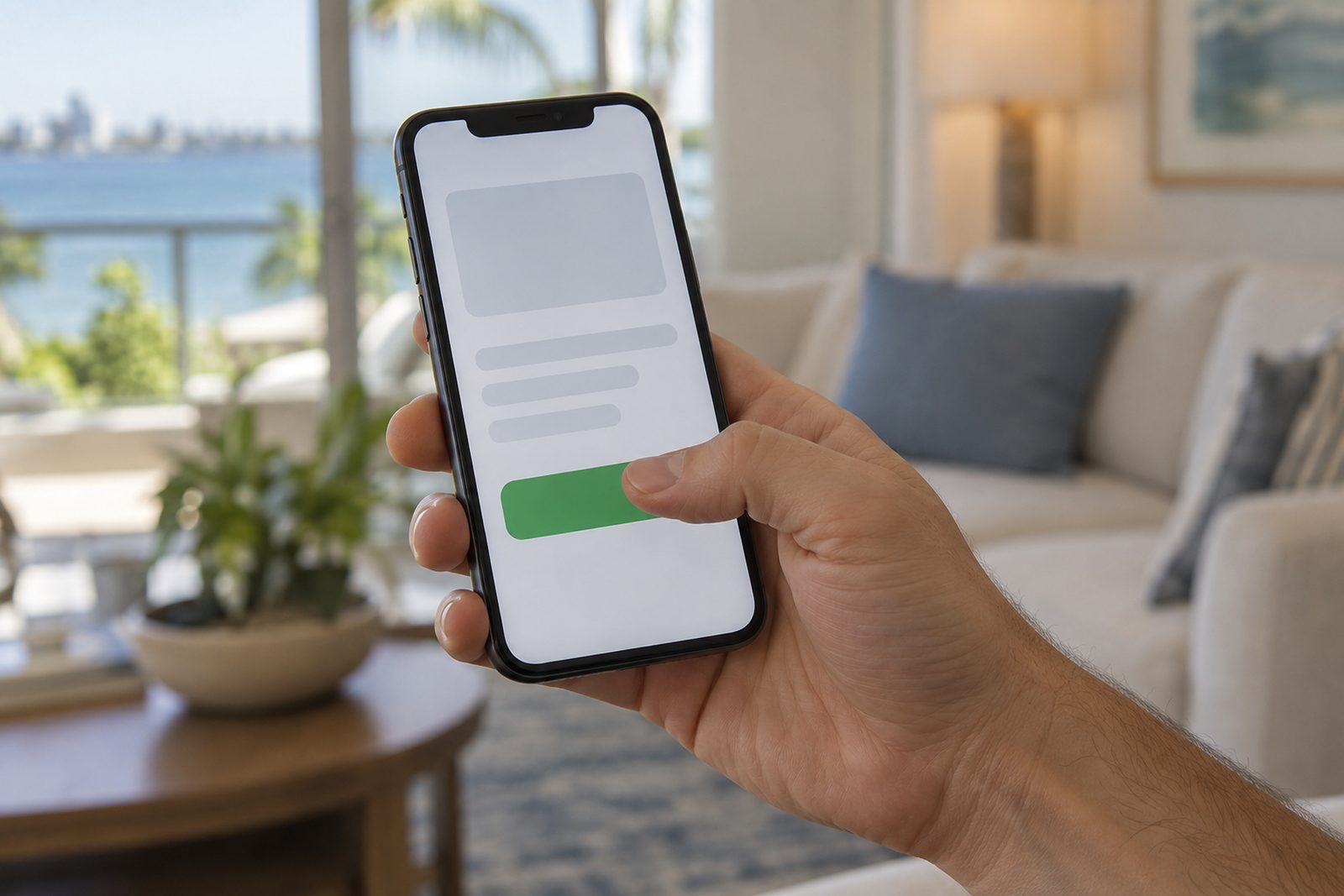
Most visitors are on a phone, holding it one handed. Tap targets need to be large enough to hit, the phone number should dial when tapped, and important actions should sit within comfortable reach rather than at the very top of a long page.
Establish credibility on the page
Reviews, recognizable client names, real photographs of real people and real work, specific results, and clear contact details all reduce the perceived risk of getting in touch. Stock photography of models in a boardroom does the opposite, because everybody now recognizes it for what it is.
Then measure it
Track which pages produce inquiries, where visitors leave, and what people do before they convert. Without that, changes are guesses. With it, you find that a small number of specific fixes account for most of the available improvement.
Related
Keepreading.
Get started
Want this doneproperly on your site?
Tell us where your business is stuck and we will show you the fastest way forward. The first conversation is free and useful.